The Direct-Route Myth: When Fewer Turns Are Not Easier
A simpler city route is not always the straightest. Use landmarks, clear decisions and familiar streets to choose a journey that is easier to follow.
The common mistake in city wayfinding is choosing the route with the fewest turns and assuming it will be easiest to follow. That direct route can cost more attention than a longer one, especially when its one big junction is confusing or its straight stretch offers no useful landmarks. For a commute, the best route is often the one that makes the next decision obvious.
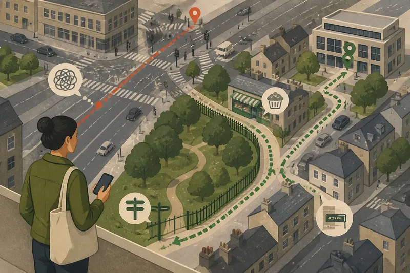
Consider a clearly invented situation. Maya has just moved to a neighbourhood and needs to walk from her flat to a shared office near a busy high street. A map offers two plausible routes: a direct walk along a broad road, then a difficult crossing, or a slightly longer path through a park edge and several quieter streets. Neither is automatically better. The question is which one Maya can follow reliably on an ordinary morning.
Turn count hides the work of wayfinding
A turn is only one kind of decision. A route with two turns may still require Maya to judge which side of a large junction to use, spot a small street entrance between parked vans and work out whether a path continues behind a row of shops. A route with more turns may offer clear corners, signs and landmarks at each change of direction.
Maps flatten those differences. They draw a junction as a neat shape and a road as a line, but the pavement can be crowded, a crossing can sit awkwardly away from the corner, and a building can hide the street beyond it. A route that looks clean on screen may demand several small corrections in person.
There is also the mental cost of uncertainty. If Maya reaches a featureless stretch and cannot tell whether she is still going the right way, she may check her phone, slow down or turn back. A landmark can prevent that hesitation even when it adds a turn. The useful measure is not how few times she changes direction; it is how easily she can recognise what to do next.
Compare the routes by their decision points
Maya first looks beyond the map’s route line. She checks each option for places where a choice is required: a fork in a path, a junction with several arms, a crossing that leads to more than one pavement, or a building entrance that is easy to miss. A route can be almost straight and still contain a demanding decision point.
On the direct route, the main challenge is a large intersection. The office lies beyond it, but several crossings meet there, and the destination is not visible from the approach. On the longer route, a park path divides near a signpost, then a familiar-looking bakery marks the turn towards the office. The longer route has more turns, but its choices are easier to identify.
That comparison changes the question from “Which route is shortest?” to “Where might I hesitate?” The answer can come from a map, a street-view image or a quick look at a local walking map. These tools are useful for spotting junction shapes and named places, but they cannot fully convey a crowded pavement or a temporary obstruction. Maya treats them as clues, not as a promise that every detail will match.
Use landmarks that confirm direction
A useful landmark does more than look distinctive. It appears at a point where Maya needs confirmation: before a turn, at a crossing or after a stretch that might otherwise feel ambiguous. A library sign, a church tower, a coloured shopfront or the entrance to a park can help her connect the map to the street.
She chooses landmarks that are visible from the route and unlikely to be confused with nearby alternatives. “Turn near the shops” is vague on a high street. “Turn left at the green-fronted bakery, then keep the park railings on your right” gives a concrete cue and a way to check that she is continuing in the intended direction.
Landmarks should not become a brittle script. A shop may be closed, a sign may be obscured or building work may change the view. Maya pairs a landmark with a street name or another stable feature where she can. If one cue disappears, the route still has a second reference point.
Familiarity can make a longer route feel simpler
Familiarity is not merely remembering every corner. It is recognising patterns: the street that slopes towards the station, the row of trees that signals the park boundary, or the point where the pavement widens before a crossing. Those patterns reduce the need to consult a screen repeatedly.
Maya has already walked past the bakery on an errand, so that corner feels recognisable. The direct route is technically straighter, but its broad road looks much like several other roads nearby. She chooses the familiar landmark route for her first ordinary commute, while keeping the direct option in mind for a day when the crossing is clear or the weather makes the park edge less appealing.
That is a choice, not a permanent verdict. A familiar route can be comfortable without being the best fit for every day. Crowds, street works, lighting and personal comfort can change the balance. The point is to know why a route feels easy, then reconsider if the conditions that support it change.
Maya’s route becomes easier to read
Imagine Maya sets out on her first work morning using the park-edge route. At the park sign, she takes the path that follows the railings rather than the branch leading towards a playground. At the bakery, she turns onto the quieter street and checks its name on the corner plate. The office entrance appears beyond a small square.
The observable result is not that the walk becomes shorter. Maya spends less time stopping to interpret the map because each cue confirms her position. If the bakery is shuttered, the street sign still identifies the turn; if the park path is busy, the railings remain a visible guide. The route gives her more than one way to recognise progress.
After the walk, she notes the one point that still caused a pause: the park fork. She saves a brief note in her phone, such as “take the branch by the park sign, not the playground path”. On the next journey, that small reminder addresses the actual difficulty rather than asking her to memorise the whole route.
Questions to ask before choosing a city route?
Is the route with fewer turns usually easier?
Not necessarily. Fewer turns can still mean a confusing junction, a long stretch without confirmation or a difficult crossing. Judge the clarity of the decisions, not just their number.
What makes a landmark useful for wayfinding?
It should be easy to recognise from the route and positioned near a decision or a point where you want confirmation. Pair a changeable feature, such as a shopfront, with a street name or another stable cue.
Should I follow the route my map app selects?
Use the app to compare route options and inspect awkward junctions, then decide whether the street-level cues suit you. If the suggested line feels unclear, check another option rather than following it simply because it is labelled direct.
When should I reconsider a familiar route?
Recheck it when street works, crowding, poor visibility or a change in your comfort makes its usual cues less useful. A route is familiar, not fixed; another path may be easier under different conditions.
Choose for readable decisions, not geometric neatness
Maya’s choice illustrates the direct-route myth: a tidy line on a map is not the same as an easy journey on the pavement. The stronger option is the one whose decision points are legible, whose landmarks confirm progress and whose pattern she can recognise without constant checking.
For your next city walk, compare two routes at the places where you must choose, not only across the whole map. Notice what you can see before each turn, what confirms you are going the right way and which cues would remain useful if one shop or sign vanished from view. That is a more dependable way to find a route that feels simple in practice.